Design Guide
Moodboard / References
-
Inspiration
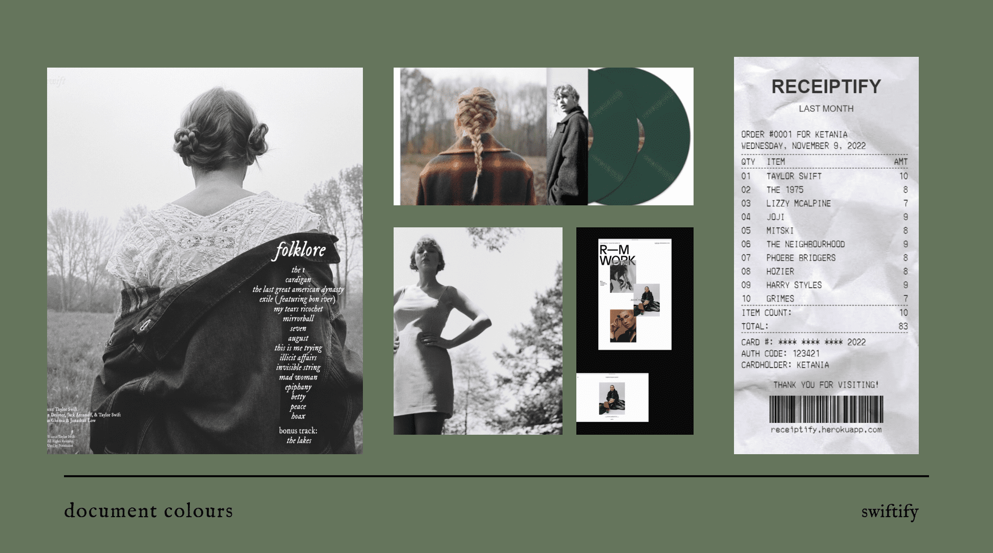
I initially wanted to recreate a site that looked similar to the spotify site. This is because at that time, I wanted to create data visualizations that focused on the user instead of a specific artist. When doing research, I found sites that used specific artists as the basis for using the Spotify Web API. This included the website Six Degrees of Kanye West, which uses the "Related Artist" endpoint to return data. I was interested in the idea of creating a site that focused on one artist. I chose Taylor Swift as the artist to focus my site on mainly because there are large datasets regarding her discography on Kaggle.
The inspiration of the site is largely based on the imagery from her album Folklore. Taylor Swift tends to have different imagery based on different albums and so creating a site that encapsulated all her work seemed aesthetically messy. Folklore tends to use mainly black and white and the photoshoot that she did for this album was taken in meadows and forest hence, a lot of greenery. This is why the background images consist of green specs and the text being in black. I have populated the site with the images from her Folklore album shoot. The special vinyl edition of her album Evermore, is pressed using a forest green pigment, hence the inspiration for the site.
I wanted to create a minimalist website and was largely influenced by editorial design to achieve this. The use of negative space therefore allows for a more open feeling, rather than overwhelming the user with a lot of content everywhere.
Colour Palette
-
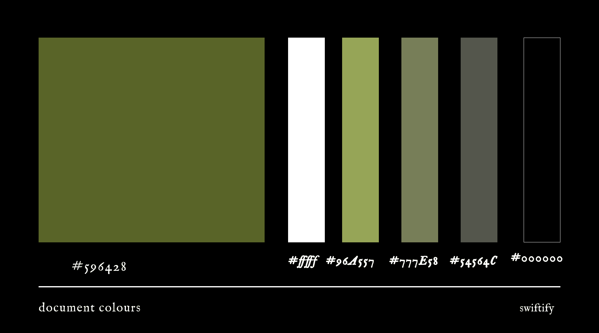
Main Colours
Following the themeing of the site, I have used the above seen colour palette. For data visualizations regarding individual albums, I have used album specific colours.
Logo Design

-
Logo Design
The Logo is simply the initials t.s since the site is about Taylor Swift.
Typography
-
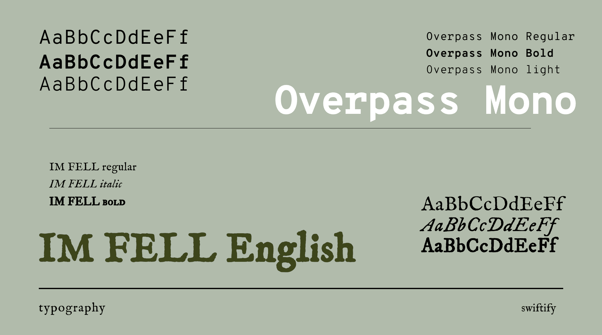
The main font for the site, IM FELL Pica, is the font that has been used for Taylor Swift's recent albums Folklore and Evermore. Since the site is targeted towards Taylor Swift fans, the font is easily recognisable. This font is used for all headings and titles. In order to create visual heirachy, I have resized, bolded and italicized elements that are not headings that use this font.
I have used the font Overpass Mono for bodies of large text. This is seen here, in the design guide and in blog posts. This font is monospace and therefore easier to read that IM FELL Pica. I have also chosen this font because it looks vaguely like a typewriter font. The imagery from Folklore which inspired this site used vintage imagery and therefore this font is congruent with the theme of the site.