Planning
Static Visualizations
-
Folkore
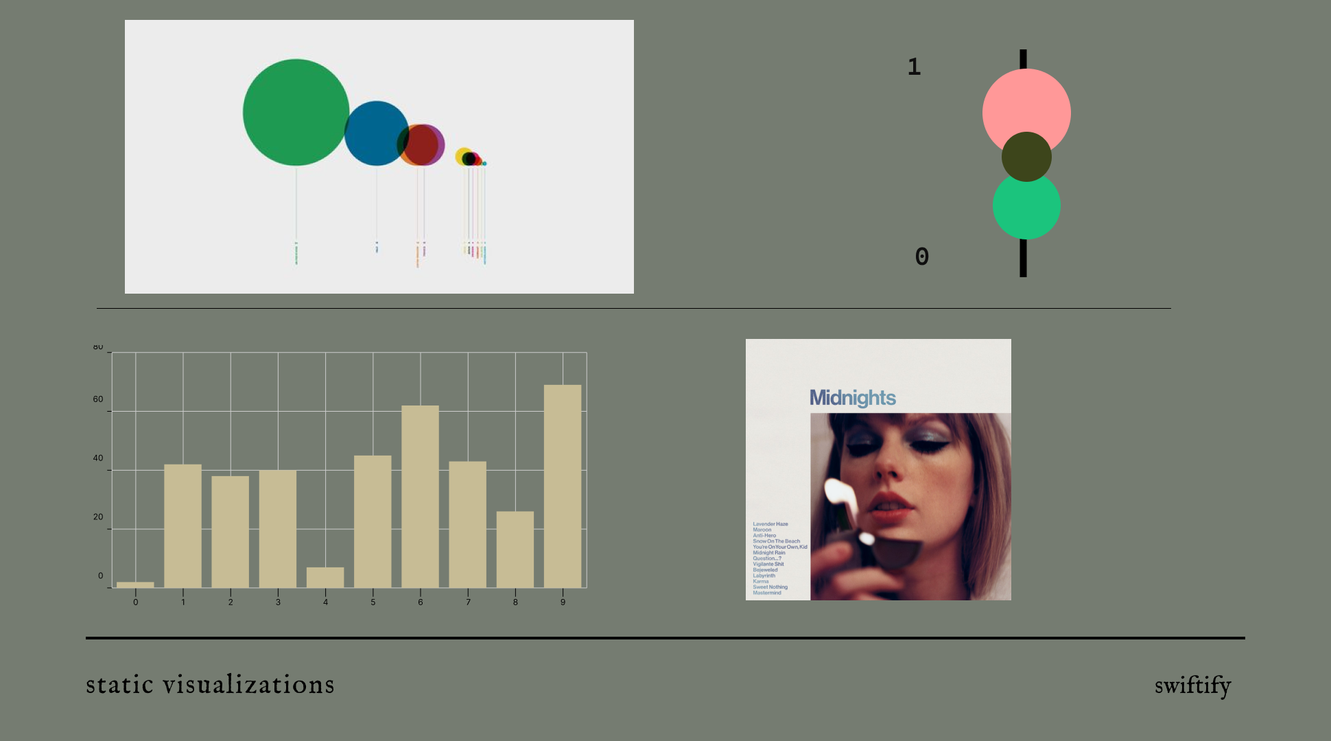
The visualiations for each folklore track was inspired by time knots. I liked the minimal look of these charts and so I wanted to implement these in my chart. I would like to create a visualization based on the audio features of each song. I will generate the colours for each feature using a colour picker on the folklore album artwork. this visualization will calculate the radius of the circle based on the value of the audio feature. Since the audio features are between 0.0001 and 1, I will have to mutliply this value. A legend is imperitive for this type of visualization.
-
Midnights
I would like to make a simple bar graph that shows the popularity of each song on the album midnights. The bar chart will be filled with a blue hue as seen on the album cover. This will have to have a range of 80-100 since the popularity of this album is quite high. This type of visualization will allow the user to see which songs have performed the best.
Interactive Charts
-
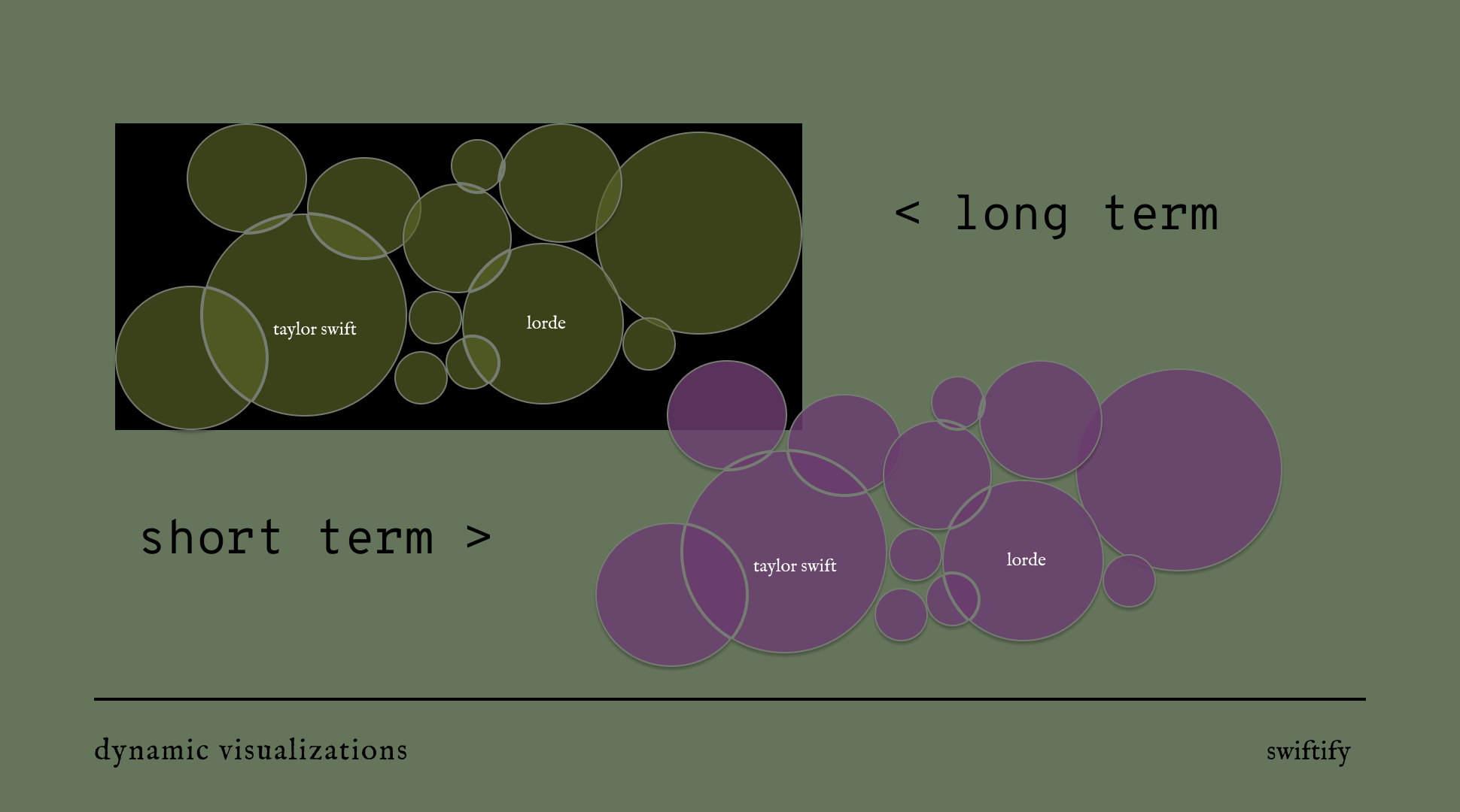
The main inspiration for the Interactive charts were the use of forces and creating dynamic charts based on data provided by the users. The size of the nodes will be generated by the followers of the users top artists. The user is then able to see clear who the most popular artists they listen to and which artists are a bit more underground. The change in data set allows the user to toggle between long term and short term artists to compare their listening history by years and weeks.
-
The second chart will be filled with a different colour in order to differntiate the data sets.
Assignment 2 Data Art
-
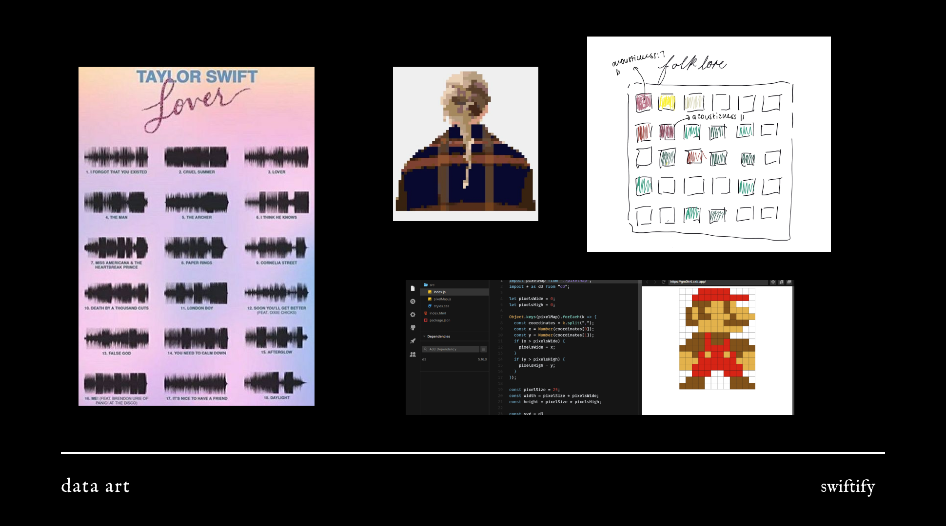
I am largely inspired by pixel art and heat maps. I wanted to depict a range of audio features at once. I will assign a linear colour scale for each feature and assign a row for each song. This is an visual abstraction of taylor swifts music
Exam Data Art
-
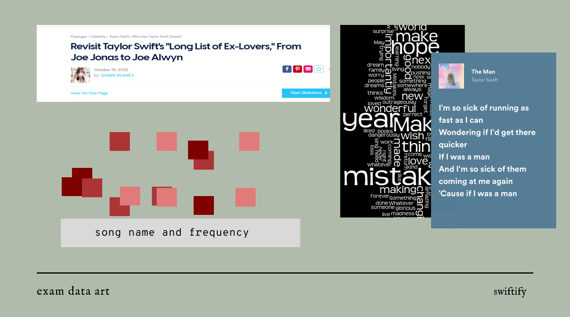
For the exam art I have made a piece of generative abstract artwork. Each dot represents a song of taylor swift and the colour indicates the frequency of break up words with higher saturation meaning higher frequecy of break up words. This was inspired by Taylor Swift's reputation or writing about her romantic life or being a 'serial dater' as seen by the screen shot of the headline attached. This work will be reflective of her work and her reputation to understand the theming of her songs. For the chart, I will use songs that are known to be written about her relationships.