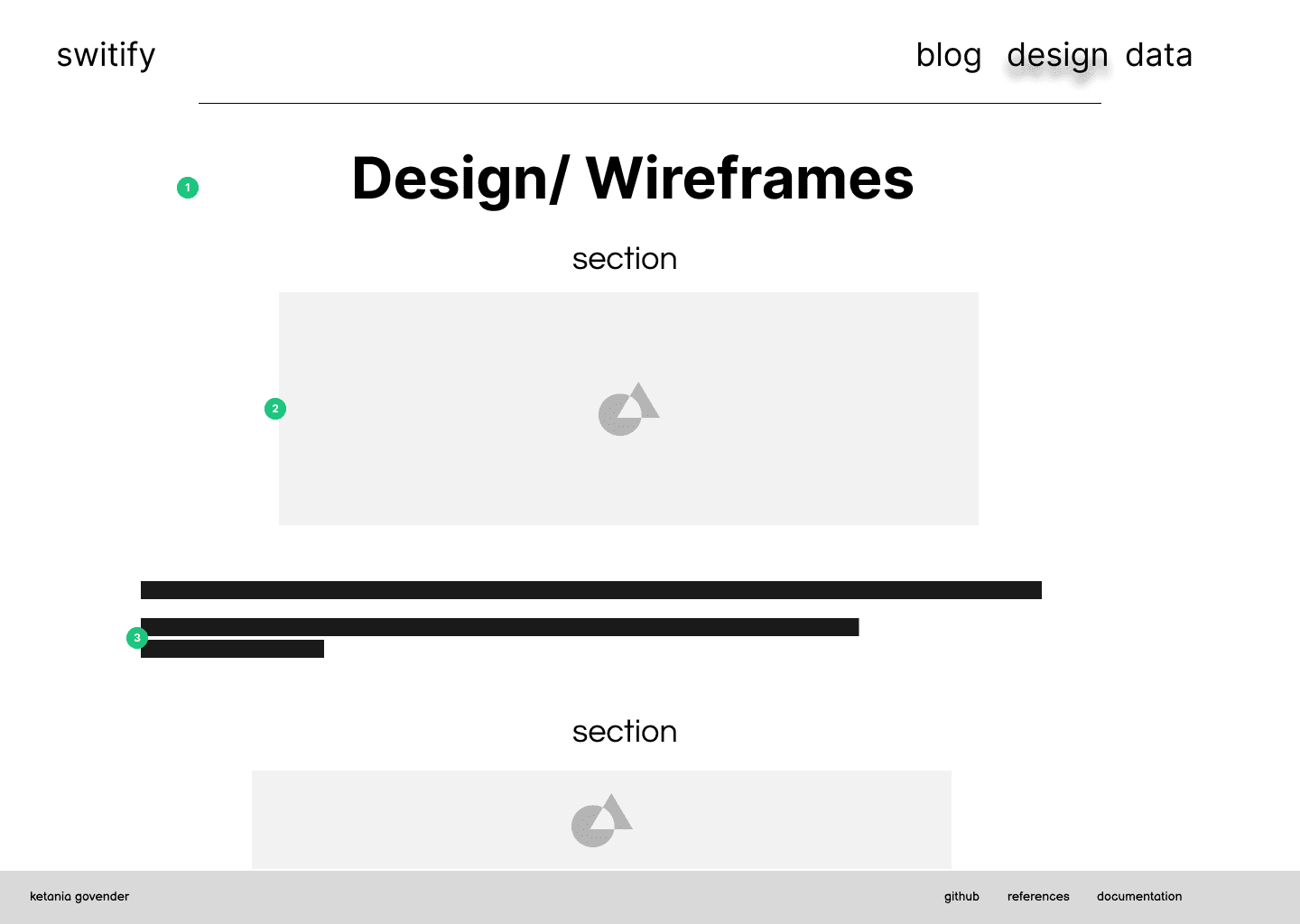
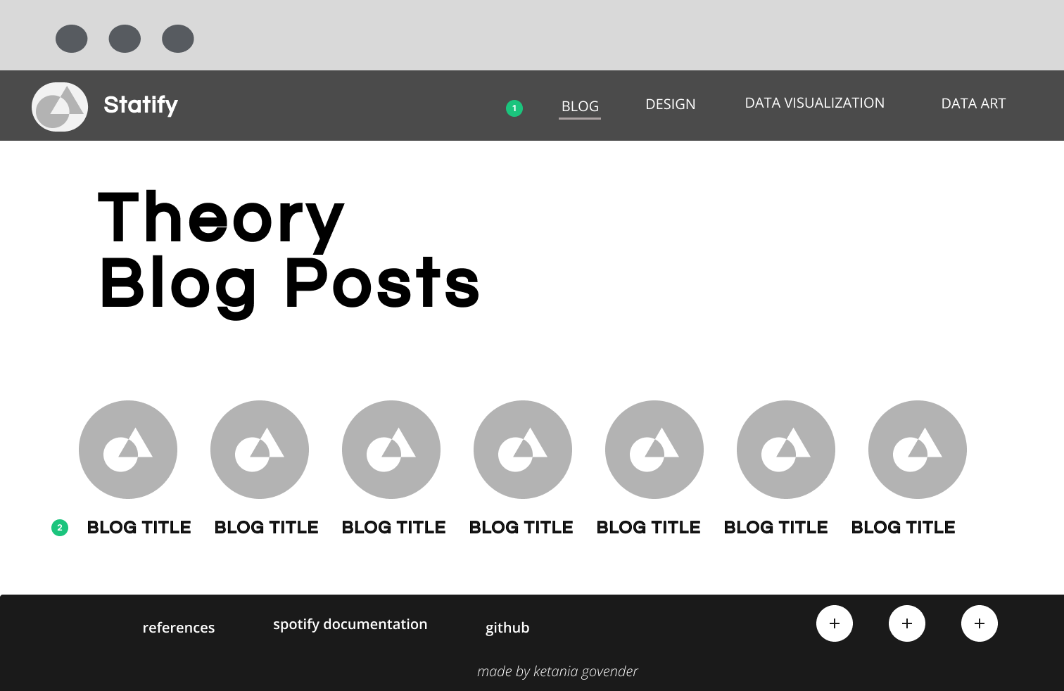
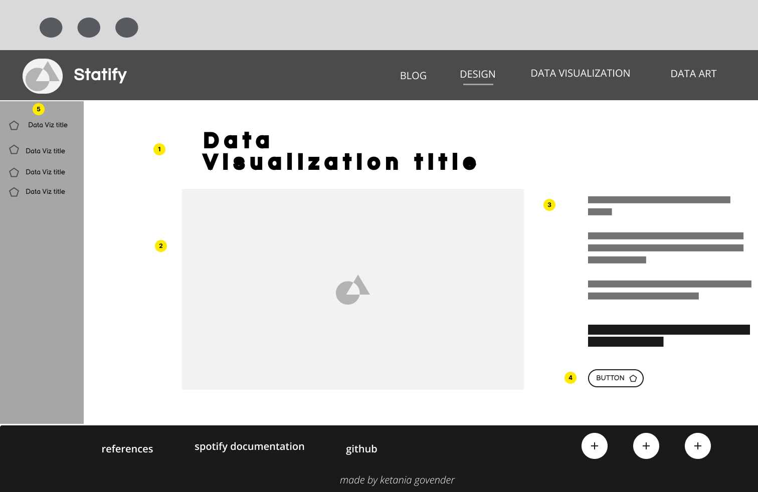
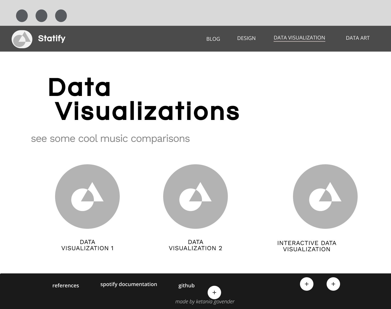
Wireframes

Wireframes for the homepage of Switify

home page


  1. Navigation - The navigation is quite simple and since it only consists of 4 links, I have decided to keep this uniform across devices. To ensure that the navigation is uniform on smaller screens, I will add simple media queries to reduce the space between the title and the links. The font for the navigation will be IM FELL PICA as this is the primary font for the site. As this font is unique and intrinsinctly linked to Taylor Swift's brand, this acts as brand identification and therefore resulted in my decision to forego the use of a specific logo in the nav bar. The simple navigation is therefore easy to understand and adheres to the minimalist feel I aim to achieve
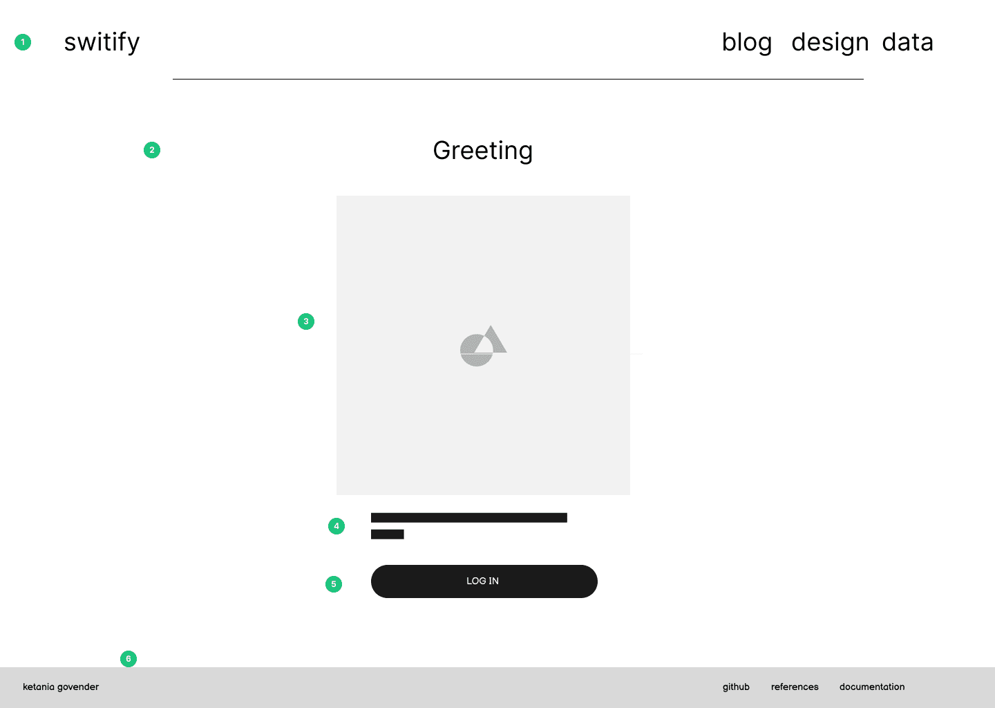
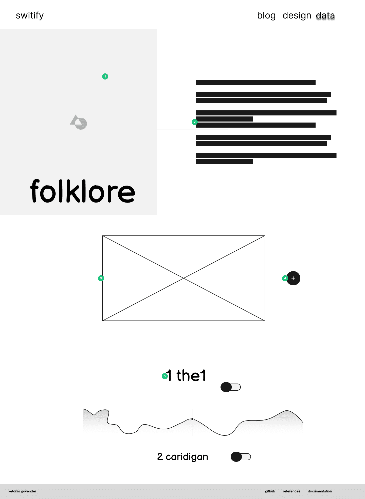
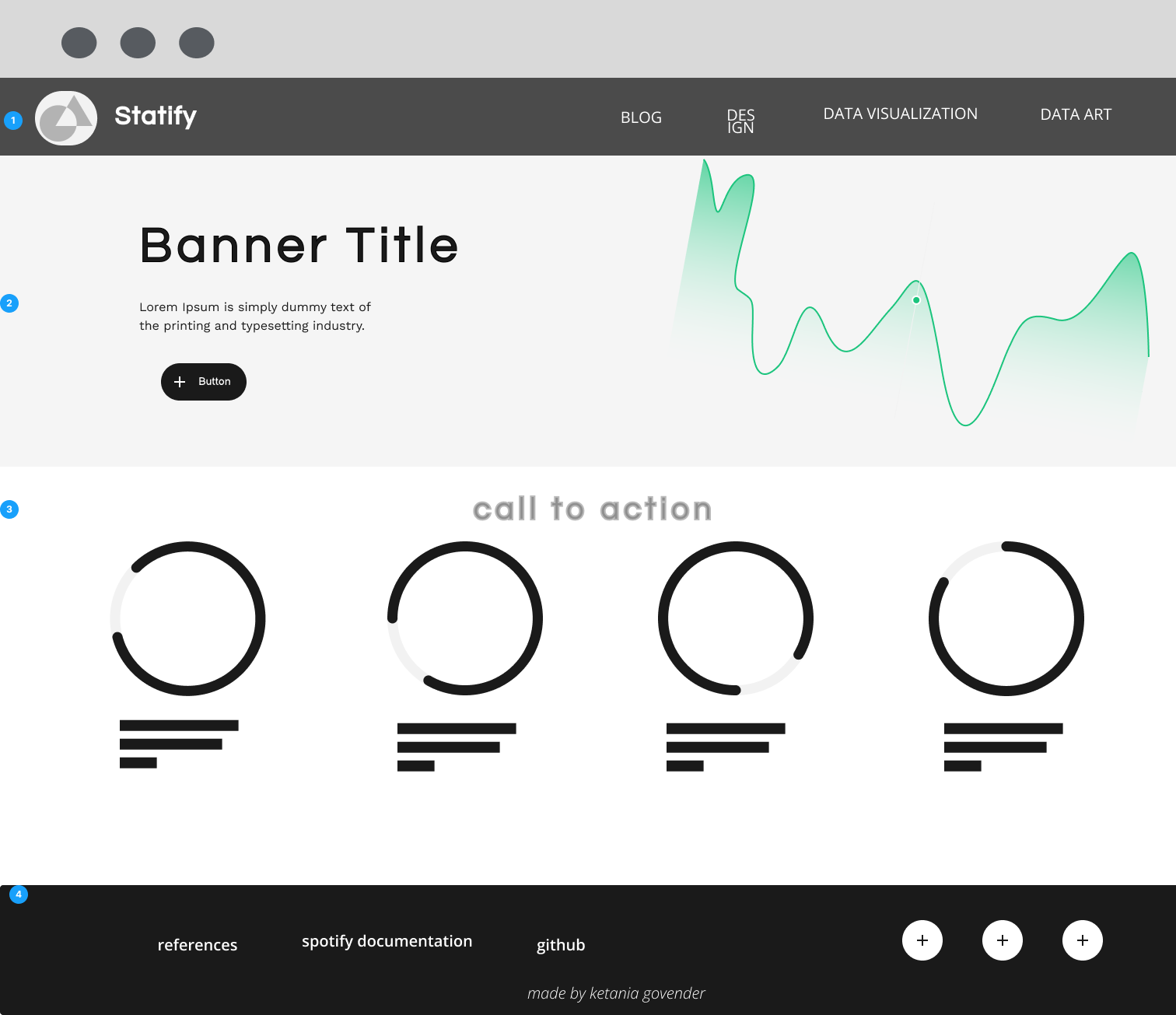
  2. Title - The home page will say Taylor Swift. This is to alert the user what the site is about.

  3. Image - The home image will be an image of Taylor Swift. Because I wanted the home page to be quite minimal, a photo that is inline with the theme of the site seemed like an appropriate choice to add more context for the site while not overloading the Ul of this page. These elements are aligned to the center in order to establish visual hierarchy as the visual elements are in focused view for the user.

  4. Call to Action - This text is used to inform the user why they should log in and click the button. This short description gives further context for the page.

  5. Log In Button - This button will be filled in with a colour darker than the tones of the rest of the page to establish visual hierarchy. This draws the users attention to the button as the functionality of this page is reliant on the button. 
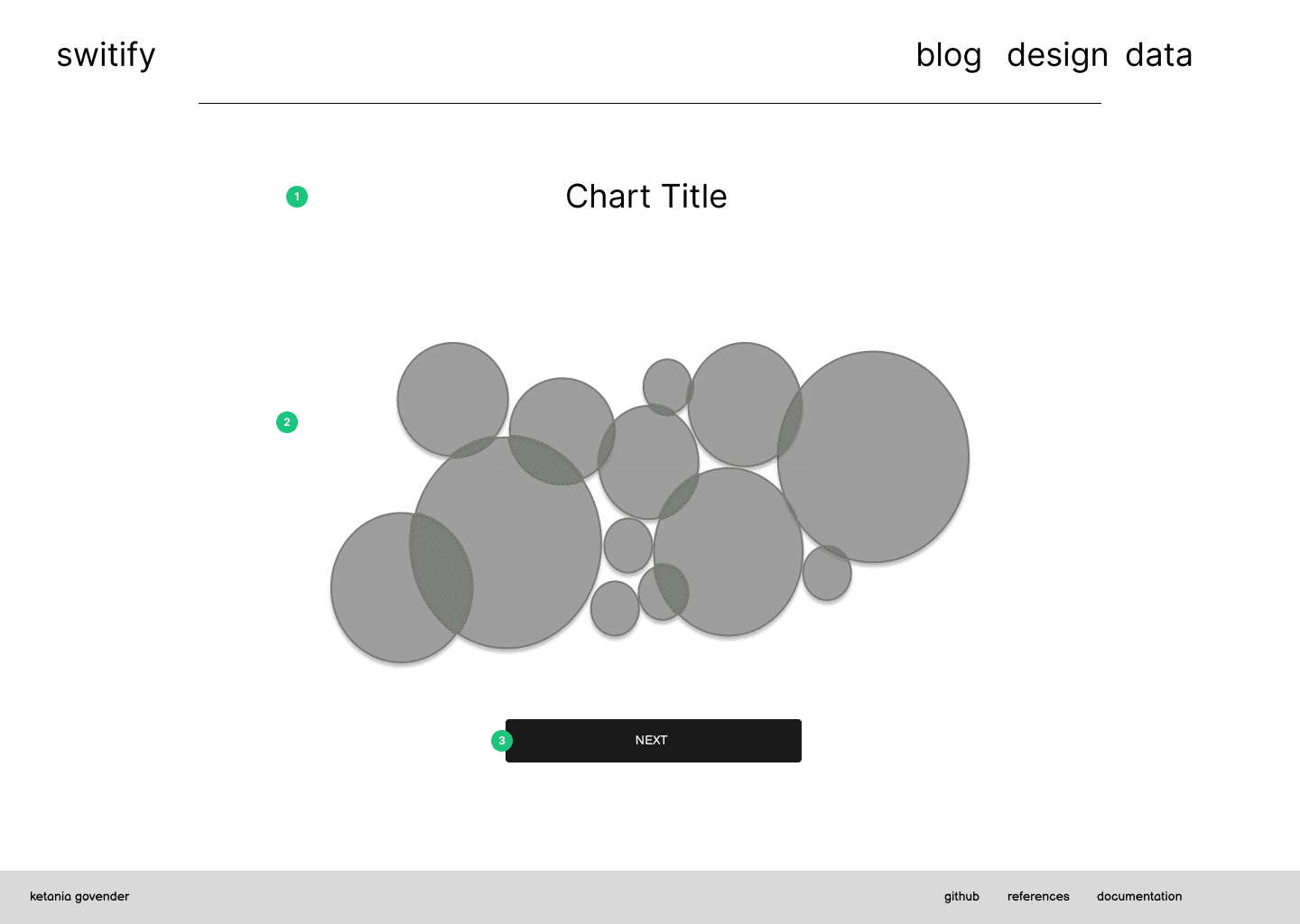
This button allows the user to authenticate the Spotify API request and will start the chart calls.
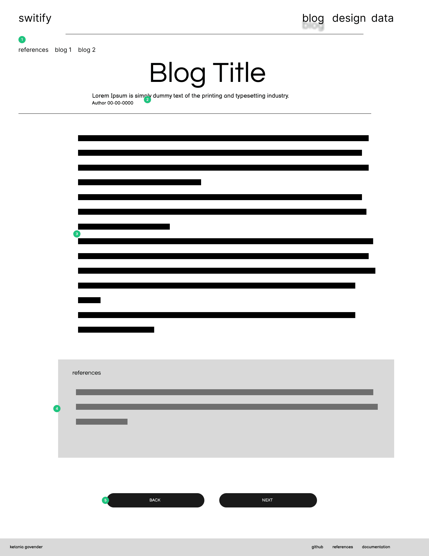
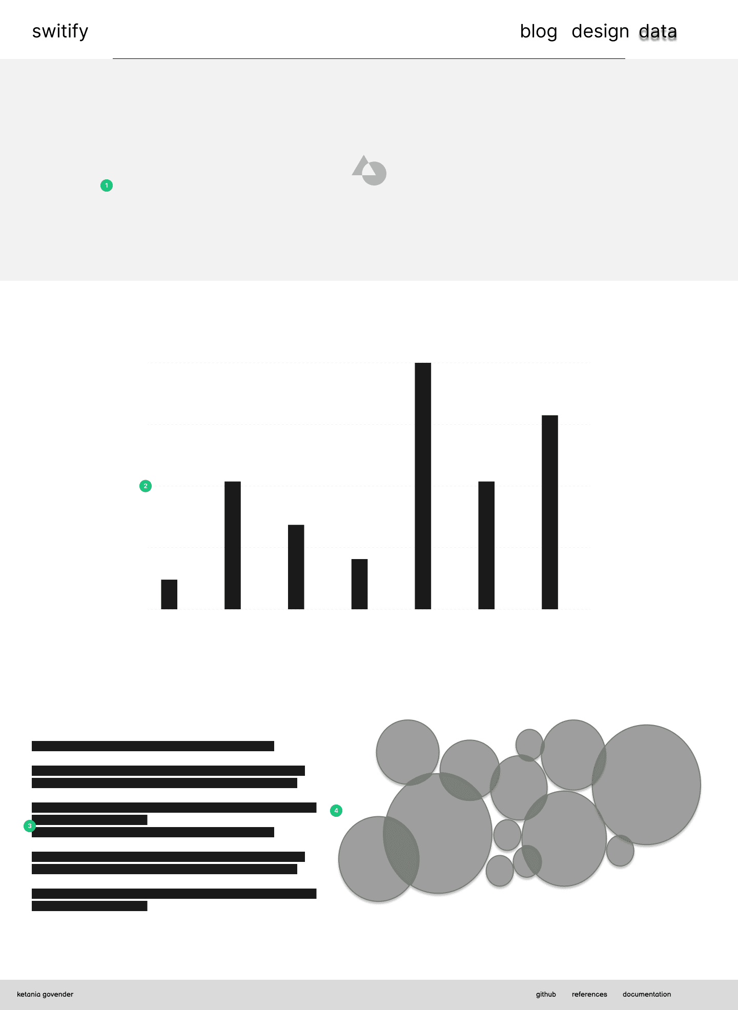
  6. footer - This is a simple footer that will stay consistent across the entire site. This consists of my name so that the user is aware of who made the site. I have also added links to other relevant links to the creation of the site that is of more interest to my markers than to a recreational visitor of the site. This allows markers access to code references, my figma file for more insight into my design and the documentation for the spotify api. The Footer is created using the same font as the navigation bar but in a much smaller font-size and lower opacity because this is secondary information that does not need to be initially apparent to the user.

Wireframes for the homepage of Switify

home page visualizations


  1. Title - The title is in clear view and gives the user context for the chart

  2. Title - The title is in clear view and gives the user context for the chart

  3. Button - Each section on the home page has a button that helps navigate to new charts and is in clear view.

Wireframes for the homepage of Switify

selection pages


  1. Cards - The post selection cards remain the same for the blog selection, design selection and data selections. This ensures uniformity throughout the site. The cards consist of a picture related to taylor swift in order to reflect the theme of the site and has a heading in IM FELL PICA. The slanted lines are inspired by editorial design and used as a border

  2. Hover - Each card will have a background-color change when hover to give feedback to the user that these are clickable

Wireframes for the homepage of Switify

blog template


  1. Mini Navigation - the mininavigation makes use of a simple list to help the user navigate between blog posts. The first link is a tag to navigate to the references. The other links allow easy access to different blogs

  2. Heading - The heading consists of the title of the blog post and a short summary, along with the author of the post and the date it was created. This information will be in IM FELL PICA because this important information that the user should be immediately aware of. The short description allows the user to understand what the post is about instead of having to read a large body of text before deciding if the post is what they wanted to read

  3. Body - The body of the blog post is centered to ensure that all the text is in comfortable reading position. I have differentiated the importance between body and title by changing the text to Over Pass Mono. This is a more readable font that IM FELL and therefore is better suited for longer

  4. References - the reference list is also in Overpass Mono yet there is a background colour to visually distinguish this compnent from the body

  5. Button Navigation - The buttons at the bottom of the page allow the user to quickly navigate between the previous blog post and the next post for easier navigation, rather than forcing the user to return to the blog selection page.

Wireframes for the homepage of Switify

design wireframes


  1. Title - The title of the post to indicate whether it is the wireframes/design guide or planning documents

  2. Images - Centered image of the wireframe or design bard

  3. Text -The text below the images give further information about the section. This will consist of annotations and explantations for design choices.

Wireframes for the homepage of Switify

data visualizations and art by album


  1. Image and Title- Since these visualizations are grouped by the album the data is related to, there will be an image from the relevant album with the name of the album over it. This lets the user know which album data they are viewing

  2. Album and data description - Information and documentation about the graphs and about the actual album to contextualize the graphs for the user before seeing the graphs

  3. Data art and visualizations - This is the main container of the data art- which visualizes elements of all the songs on the album and can be toggled to view different graph data

  4. Toggle - Button that allows the user to toggle through different visualizations and graphs other than the data art

  5. Data visualizations or individual graphs - this looks like a list of tracks yet will have a simple toggle button to show and hide graphs about the audio features of each song

Wireframes for the homepage of Switify

overview data visualizations for taylor swift


  1. Banner - This banner will be of Taylor to continue the theme of the site

  2. Interactive Graphs - A clear section that is visible to the user to view different visualizations regarding Swift's entire body of work. This will have different sets of data

  3. Write up - A write up regarding the data being displayed for more information for the user

  4. Static Visualization - A simple bubble chart with the related artists to Swift that is smaller since users interested in Taylor Swift should prefer the information directly related to her rather than other artists

Outdated Wireframes

Old Wireframes


For assignment 2, the wireframes that I had produced were high fidelity wireframes and therefore needed to be changed for the exam submission. I originally made my wireframes this way so that I knew exactly where I wanted to place each object and how to style everything. I have since revised these wireframes with low-fidelity wireframes to show my initial planning steps. Linked here are my wireframes, created in Figma and prototyped.